With the February 2024 update to Power BI, we finally got Visual Calculations (blog post coming no doubt), but something that got overlooked were some minor updates to existing visualisations. The one that caught my eye were the tweaks made to the column chart. As an advocate for clear data communication, I was pleased to see that we can now get closer to IBCS style charts with native Power BI visuals, without having to use Deneb or SVGs to get us there.
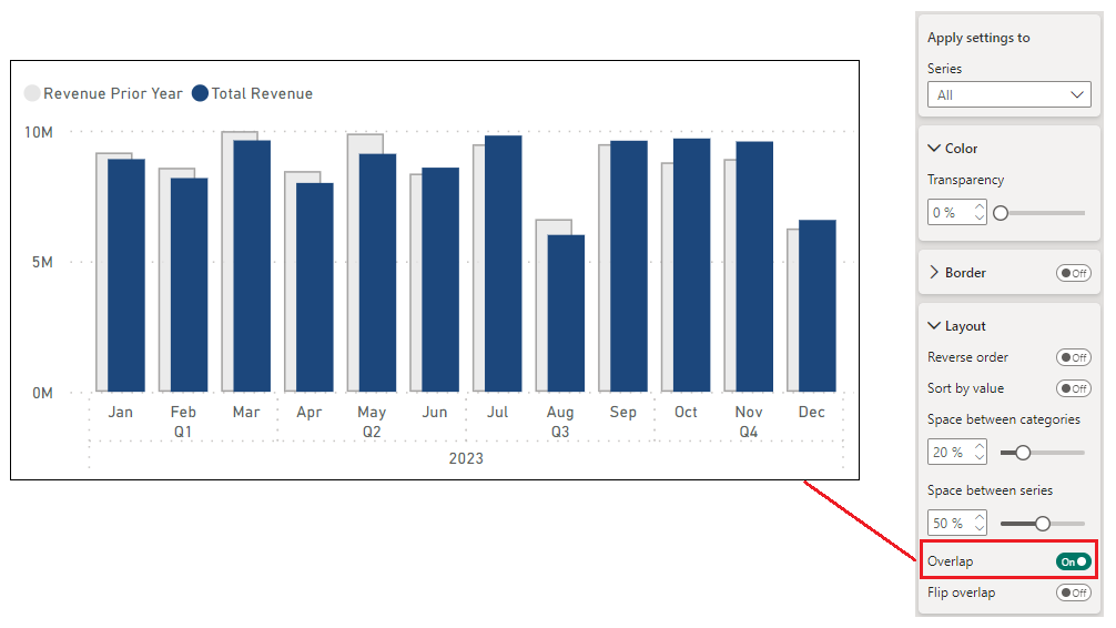
I have a dashboard where I need to subtly compare current year actuals with prior year and this is something that is not easy to do in Power BI natively. However, with the February 2024 update, this can be easily achieved. The update is buried in the style pane of the visual but it's impact is impressive. The feature is "overlap" found within the 'columns' section of the column chart style settings.

The introduction of this toggle feature has significantly simplified and enhanced the clarity of comparing multiple data series. This enhancement allows us to overlap shapes within clustered series, enabling both columns and bars within clusters to intersect. It expands the spatial interval between series from a minimal 0% to a full 100%. This adjustment not only makes the comparison of data series more dynamic and visually appealing but also aligns with the International Business Communication Standards (IBCS) by offering a versatile approach to data visualisation.
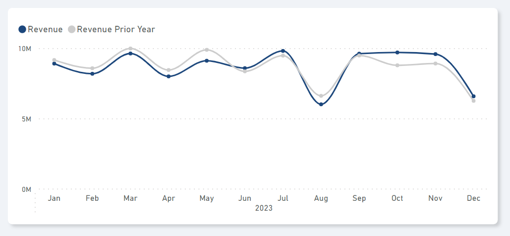
Similarly, this is now matching the line chart that I have showing the same underlying data:

If you're interested in the DAX to produce a dynamic Prior Year (PY) measure, I use the below which is my [Total Revenue] measure and [Total Revenue PY] measure:
Total Revenue =
IF (
    ISBLANK ( SUM ( Invoices[RevenueUSD] ) ),
    BLANK(),
    SUM ( Invoices[RevenueUSD] )
)
Total Revenue PY =
IF (
[Total Revenue] = 0,
BLANK (),
CALCULATE ( [Total Revenue], SAMEPERIODLASTYEAR ( 'Date'[Date] ) )
)
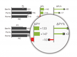
I'm always looking to keep my visuals as clean as possible and reduce all the unnecessary "noise" that clutter the page. However, I am thinking about adding a small red/green delta column to the column chart in order to better indicate the variance between AC and PY. This is something that I have seen in the IBCS document where they show it as a separate mini visual:

❤️ Enjoyed this article?
Forward to a friend and let them know where they can subscribe (hint: it's here).


