
Pie charts are one of the most widely recognised and frequently used chart types in data visualisation. They are often included in business presentations, reports, and even academic papers. Despite their popularity, many experts have criticised the use of pie charts, arguing that they are ineffective in communicating information.
As someone who works with data on a regular basis, I am firmly in the camp of those who believe that pie charts should be abandoned in favour of more effective chart types. In this article, I will explore why I think pie charts should be avoided and suggest some alternatives for displaying data.
First and foremost, the problem with pie charts lies in our visual perception. Our brains are not designed to accurately assign quantitative values to 2-D areas, and we have an even harder time when a third dimension of depth is added. While slices of a pie may look visually appealing, they are particularly difficult to compare. Even less-challenging geometric shapes, like rectangles, are not much better. If they are fairly close in size, it is difficult if not impossible to tell which is bigger. And when they are not close in size, the best we can do is determine that one is bigger than the other, but we cannot judge by how much.
Look at the following pie chart and try to put the following 'slices' in order from largest to smallest:
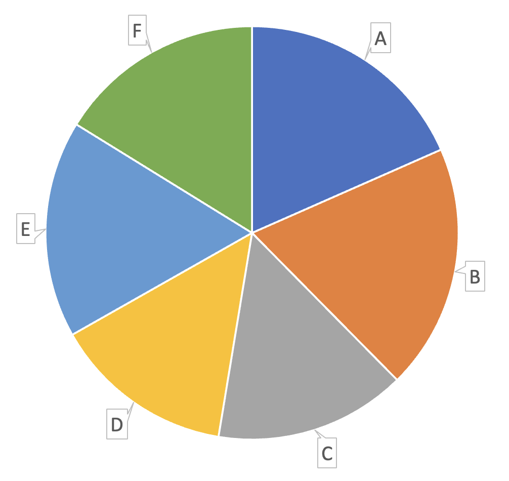
It may look like the size of each slice is very close, but here lies the issue with humans not able to assess 2-D areas. Maybe this would be easier if we put data labels on each slice, but this now forces your reader to move their eyes all the way around the circle, as well as across the whole chart to mentally try to order each category and rank them accordingly.
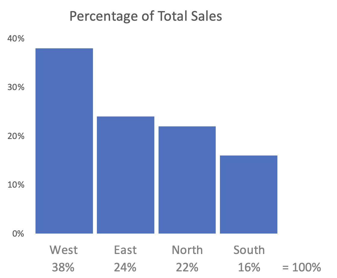
Let's put the same data into a bar chart:
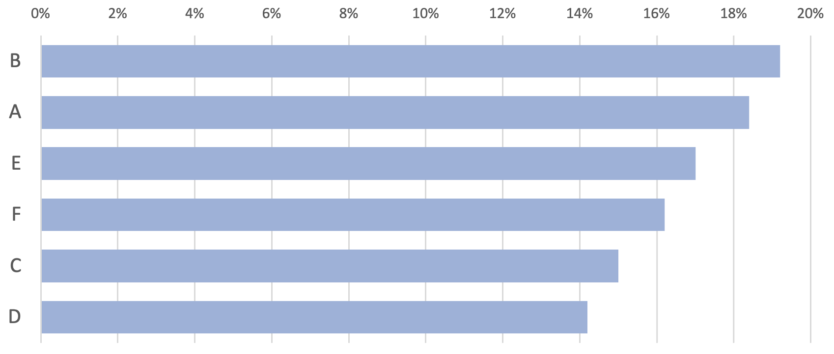
This is now a lot less taxing on the reader and it's clear each category is quite different. We've also reduced the cognitive load by already sorting the data by largest first.
Stacked column charts are often thrown into the data visualization mix to show part-to-whole relationships. However, let's be real, a single stacked column is only slightly better than a sad little pie chart in terms of effectively conveying information. Look at the following example:
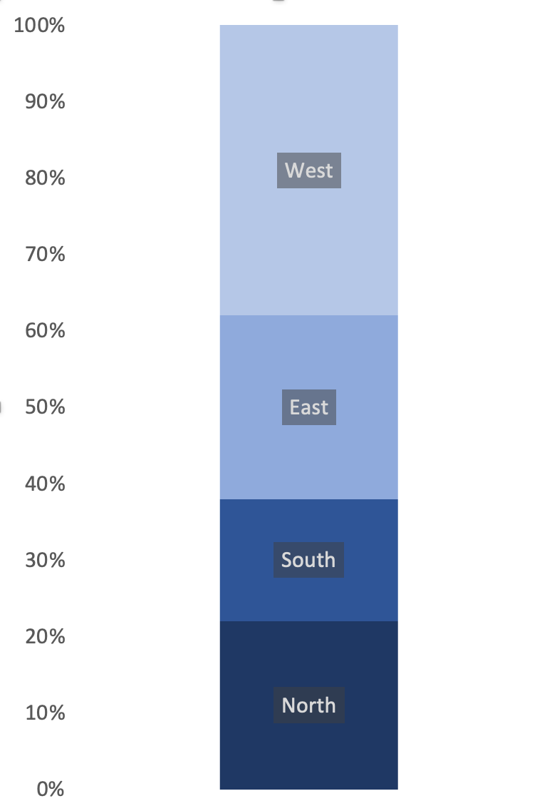
You may easily determine the percentage value associated with the 'North' region but it's not as easy to determine the value for any of the others. The value of the north region is easy because all you need to do is look at the percentage scale on the axis and the value is right there. For the next area ('South') you need to look at the top and bottom (roughly 38% and 23%), then subtract the smaller from the larger value to get its percentage (around 15%). In other words, you have to do some maths to determine the value. Eurgh.
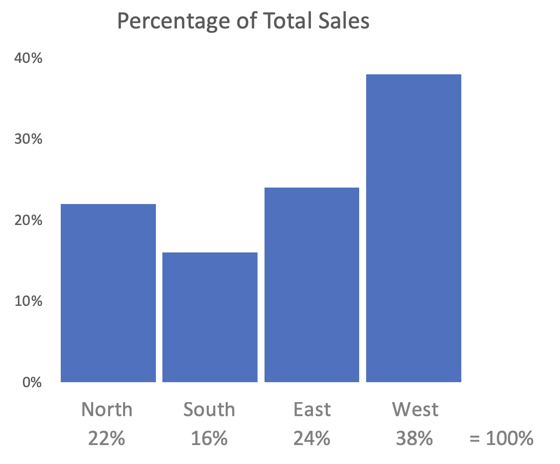
Look what happens when you put this data into a column chart:
We could also relieve more cognitive load and make it easier to compare the two regions that have close percentages by reordering the data:
It's clear that pie charts are not very versatile. They are best suited for displaying proportions of a whole, but they cannot display absolute values or comparisons between categories. For example, a pie chart can show the percentage of revenue generated by each product category, but it cannot show the total revenue or the difference between two categories.
In contrast, other chart types like bar charts, line charts, and scatterplots are much more versatile and can display a wider range of data types and relationships. By choosing the right chart type for your data, you can ensure that your message is communicated accurately and effectively to your audience.
TL:DR - There's hardly ever an occasion where a pie chart is the best option for data visualisation.
❤️ Enjoyed this article?
Forward to a friend and let them know where they can subscribe (hint: it's here).


