
Alt text (alternative text) is a description that is added to a graphical image to support and describe what the visual represents. Doing so helps the viewer understand the graph and what it's purpose is and more importantly, helps people with impairments to also find insight in the graphical information.
The text in the alt attribute is used to replace the image when the image cannot be loaded, without changing the intended meaning of the page's contents. The W3C's web content accessibility guidelines state that the alt attribute is used to convey the meaning and intent of the image, rather than being a literal description of the image itself.
The use of descriptions in the alt attribute improves search engine optimization and allows image-specific search engines, such as Google Images, to search for and display relevant images that are used on websites in search results.
Top Reasons For Including Alt Text
- Adding it to images on your site is a principle of web accessibility.
- It will be displayed in place of an image if an image file cannot load.
- It provides better image context to search engine crawlers, helping them to index and rank an image properly in image search.
The Golden Formula For Good Alt Text
alt = "CHART TYPE of TYPE OF DATA where REASON FOR INCLUDING CHART"Chart Type
Example: Bar Chart
This is helpful to people with sight difficulties and helps to intially build a mental picture to the rest of the visual
Type Of Data
Example: comparison of total number of films per year released in Jan vs. October
This is pretty obvious, but what you're doing is simply explaining what the data is. The best way to think about this is to think about what the x and y axes are representing.
Reason for including the chart
Example: in the last 20 years, October has significantly overtaken January as the most popular release month for horror films
This is the why of that chart. What is it's importance? What purpose does it serve? There should be a reason why the chart is important in your work.
Link to a data source
Example: https://www.imdb.com/
No data analysis or summary is fully credible without a direct link to where the original data is sourced from. It is always best practice to include a link or information where the readers of your work can find the original data that your work is based on.
Example 1:
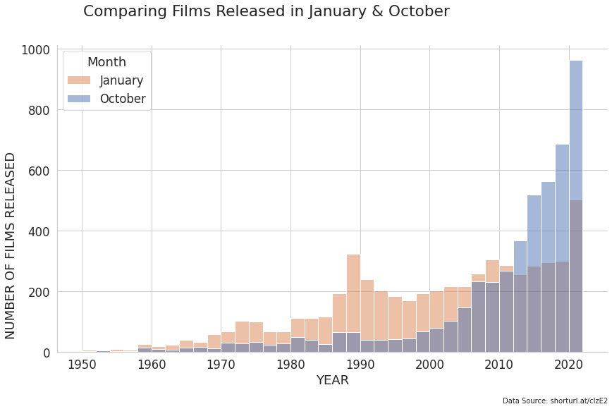
alt= "Bar chart of number of horror films released per year where January and October are compared which shows the substantial increase in October releases"Example 2:
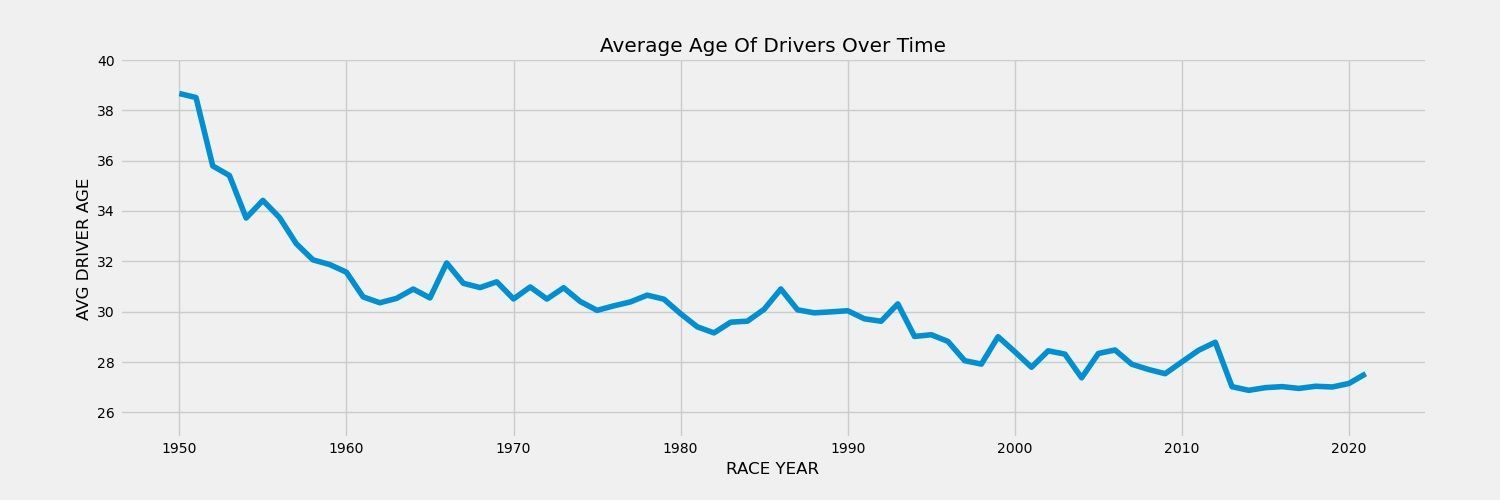
alt= "Line chart of average F1 racer age per year where the average age has fallen by over 10 years"❤️ Enjoyed this article?
Forward to a friend and let them know where they can subscribe (hint: it's here).


