
Although this is my latest post about my journey with Python, this is one of the first projects I did back in January 2022. With this is mind, there's probably lots of inefficiencies in the scripts so be gentle!
Let's begin, as usual, by importing the various tools we'll need:
import pandas as pd
import numpy as np
import matplotlib.pyplot as plt
%matplotlib inline
import matplotlib.patches as mpatches
from matplotlib.pyplot import figure
Let's read in the data:
data = pd.read_csv('data\KCC_Libraries.csv')Let's take a quick look at the data:
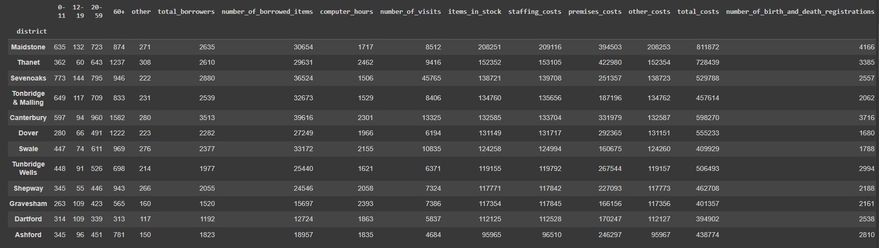
data.groupby(["district"]).sum().sort_values("items_in_stock", ascending=False)
It looks like we've got some ugly structures of the data - the age brackets being in separate columns will need to be ran through an 'unpivot' process.
data_unpivot = data.melt(
    id_vars=[
        "district",
        "location",
        "total_borrowers",
        "number_of_borrowed_items",
        "computer_hours",
        "number_of_visits",
        "items_in_stock",
        "staffing_costs",
        "premises_costs",
        "other_costs",
        "total_costs",
        "number_of_birth_and_death_registrations",
    ],
    var_name="age",
    value_name="number_of_borrowers",
)

data_unpivot[['district', 'location','age','number_of_borrowers']]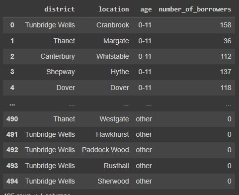
This code above has taken the age bracket columns (which were 0-11, 12-19, 20-59, 60+) and created a row for each age bracket. This is what we call 'unpivoting' the data and is something that you might be familiar with if you've used the unpivot feature in Excel. This will be useful later when we want to do some analysis on the profile of library members by age.
Let's now do some basic charting based on the data.
plt.figure(figsize=(8, 6), dpi=100)
plt.barh(big_libraries['location'], big_libraries['number_of_visits'], color='#F4B860', label='Total Visits')
plt.barh(big_libraries['location'], big_libraries['total_borrowers'], color='#C83E4D', label='Total Members')
plt.gca().spines['top'].set_visible(False)
plt.gca().spines['right'].set_visible(False)
plt.legend()
plt.ylabel('Location')
plt.suptitle('Is the library with the biggest membership the busiest?')
plt.figtext(0.9, -0.05, 'Data Source: https://www.kent.gov.uk/', horizontalalignment='right', fontsize=6)
plt.savefig('Biggest_Busiest.jpg', bbox_inches='tight')
plt.show()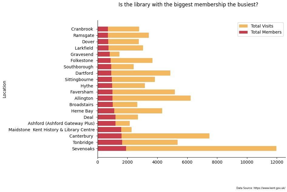
total_items = data.groupby('district').sum().sort_values('items_in_stock', ascending=False).reset_index()[['district','items_in_stock','number_of_visits']]
total_items
plt.figure(dpi=100)
plt.barh(total_items.district, total_items.items_in_stock, color='#F4B860', label='Total Library Items')
plt.barh(total_items.district, total_items.number_of_visits, color='#C83E4D', label='Total Visits')
plt.gca().spines['top'].set_visible(False)
plt.gca().spines['right'].set_visible(False)
plt.legend()
plt.ylabel('Number of Items Available')
plt.suptitle('Number of items vs. Number of borrows')
plt.title('per District')
plt.figtext(0.9, -0.1, 'Data Source: https://www.kent.gov.uk/', horizontalalignment='right', fontsize=6)
plt.xticks(rotation = 60)
plt.savefig('Items_Borrows.jpg', bbox_inches='tight')
plt.show()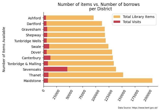
computers = data.sort_values('computer_hours', ascending=False).head(10)[['location','computer_hours']]
computers
plt.figure(dpi=100)
plt.barh(computers['location'], computers['computer_hours'], color='#C83E4D')
plt.gca().spines['top'].set_visible(False)
plt.gca().spines['right'].set_visible(False)
plt.legend()
plt.ylabel('Location')
plt.xlabel('Total Hours')
plt.suptitle('Number Of Computer Hours Logged Per Disctrict')
plt.figtext(0.9, -0.05, 'Data Source: https://www.kent.gov.uk/', horizontalalignment='right', fontsize=6)
plt.savefig('Computer_Hours.jpg', bbox_inches='tight')
plt.show()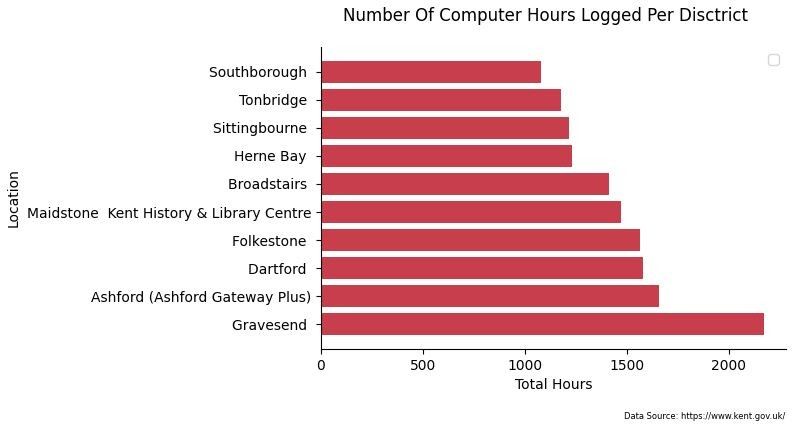
ages_by_district = data.groupby('district').sum().reset_index().sort_values('60+', ascending=True)[['district','0-11','12-19','20-59','60+','other','total_borrowers']]
ages_by_district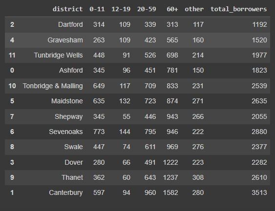
plt.figure(dpi=100)
plt.barh(ages_by_district['district'], ages_by_district['0-11'], color='#6699CC', label='0-9')
plt.barh(ages_by_district['district'], ages_by_district['12-19'], color='#4A5859', label='12-19')
plt.barh(ages_by_district['district'], ages_by_district['20-59'], color='#A0EEC0', label='20-59')
plt.barh(ages_by_district['district'], ages_by_district['60+'], color='#F4B860', label='60+')
plt.barh(ages_by_district['district'], ages_by_district['other'], color='#C83E4D', label='other')
plt.gca().spines['top'].set_visible(False)
plt.gca().spines['right'].set_visible(False)
plt.legend()
plt.ylabel('Number Of Borrowers')
plt.suptitle('Number Of Borrowers Per District')
plt.figtext(0.9, -0.05, 'Data Source: https://www.kent.gov.uk/', horizontalalignment='right', fontsize=6)
plt.savefig('District_Ages.png', bbox_inches='tight')
plt.show()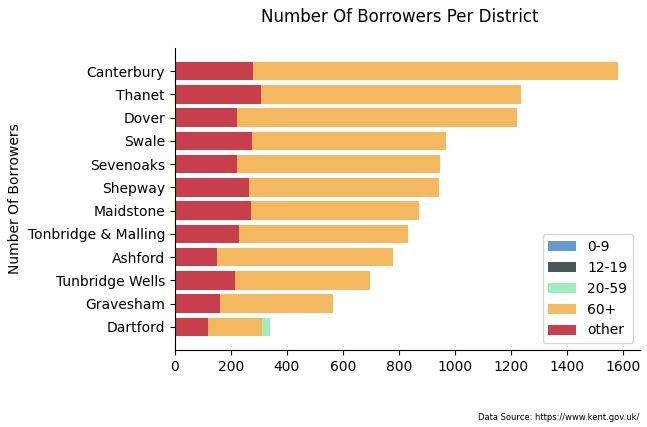
I think it's quite interesting how the vast majority of users of libraries within Kent County Council are the older generation - so much so, the younger age groups hardly register on the chart at all. It makes me wonder how much this is due to the birth of the internet and how younger generations find information online rather than trips to their local library. There may be some influences by companies like Amazon bringing out digital eReaders, and audiobooks by Audible too.
It's funny looking back at code written 9 months ago when I was only a few weeks into learning about Python tools used for data analysis such as Pandas, NumPy, and Matplotlib. It makes me wonder what it will be like looking at my later stuff in a years time. I know that I haven't touched any machine learning (ML) tools yet or used the power of emerging AI tools so that's on my bucket list for the future.
For now though, that's it from me.
❤️ Enjoyed this article?
Forward to a friend and let them know where they can subscribe (hint: it's here).


